
Purpose
To add a reference line such as an average or benchmark to a horizontal bar chart.
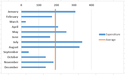
This is similar to how to add a reference line to a vertical bar chart in Excel, but with a few more steps.

Video – see full step by step description below the video
- Add the data for the average line to the chart
- Change the average line series chart type to ‘Scatter with Straight Lines’
- Amend the secondary vertical axis if the line doesn’t match the chart height, and switch off the secondary axes.
Method – example, add an average line (see video above)
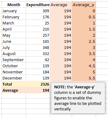
- Calculate the average and add the values to the column next to your chart values. The average values will later be used as the ‘x’ values for your line.
- Add a set of ‘dummy’ values in the next column
(‘Average_y’ in the example on the right) – these will be used later as the ‘y’ values for your line, and enable the line to be drawn vertically. - Click on the chart to select it, and from the Design tab, click on the ‘Select Data‘ icon.
- In the left hand pane (Legend Entries (Series)), click on the Add icon, and in the popup window, select the column header of your helper column, for the series name, and the column of values for the series values.
- The bars for the average values will be added to the chart.
- Click on one of the bars for the average values, and right-click. Select ‘Change series chart type‘.
- From the Chart type dropdown next to the Average series name, select ‘Scatter with straight lines‘. The average values will now be displayed as a short horizontal line.
- Right-click on the line – you will now edit the data values to make the line display as a vertical line across the chart.
- Select the ‘Average’ dataset, and in the pop-up you’ll see there are fields for series name, x values and y values. Add the (real) average values into the x field, and the (dummy) ‘Average_y’ values into the y field.
- Click OK and the average line will now be vertical across the chart.
- One more step though may be needed! Excel may add a bit of extra length to the secondary y axis, so your average line isn’t quite matching the height of the chart. If so, you can just edit the minimum and maximum values of the axis to match the dummy values that you have set in the ‘Average_y’ column.
- Remember to remove the secondary vertical and horizontal axes – click on the plus icon next to the chart, and deselect the secondary axis items.