
Purpose
Create a chart in Excel with categories and sub-categories

Method (see video above)
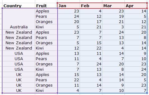
- First, lay out your data so that your main categories are in the left hand column of your data table, your sub-categories are in the next column, and then your value column(s) are to the right of that.
- Highlight the first cells with the same category group (‘Australia’ in the example below), right-click, and select ‘Merge and Center‘ (or select the cells and select ‘Merge and Center’ from the ‘Home | Alignment‘ section of the ribbon).
- Click OK to the popup alert which states ‘Merging cells only keeps the upper-left value and discards other values.’
- Repeat with the other categories — select each set of cells and press F4 to repeat the merge.
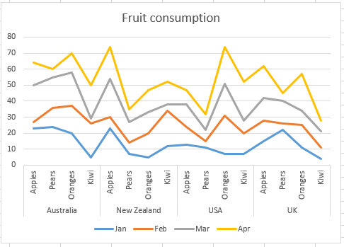
- You’re now ready to create your chart. Click anywhere in the data table, and press ALT-F1. A chart will be added which you can then customize.
- Alternatively, you can highlight the data for the chart, and select a chart from the ‘Insert | Chart‘ section of the ribbon.

To create a chart in one click, select a cell within your data table, and press ALT-F1. A chart will appear which you can then customize.
To repeat the previous action in Excel, press F4 (this will apply to many, but not all, of the actions in Excel; it will depend on the context whether the action is repeatable).