
How to import data, use the check.names function, replace variable names, transform data between wide and long formats, and plot the data in R using plotly
Links to steps shown below:
- Base R check.names function.
- Import data using ‘read.csv’.
- Option1: Use check.names=FALSE to prevent R from checking and replacing variable names (column headers).
- Option 2: Replace the default column headers if check.names=TRUE and R renames variables (column headers)
- Transform the data from wide to long to plot the x and y values.
- tidyr gather() function example.
- Plot the data using plotly.
- Plotly example code explained.
- Common cause of no line appearing on a plotly plot.
- Code with comments.
Base R check.names function
check.names=TRUE/FALSE is a logical argument in base R, in the data.frames() function. It can also be used as an argument in the read.csv() function, see example below.
library(tidyr)
library(dplyr)

myData <- read.csv("r_transformData.csv", check.names=TRUE, header=TRUE,
stringsAsFactors=FALSE)
If check.names is set to TRUE, then the names of the variables (column headers) in the data frame are checked to ensure that they are syntactically valid, and are not duplicated. If they appear to not be valid or are duplicated, R will rename them.
The default value is TRUE — even if check.names is not explicitly included as an argument in the read.csv() function, R will check the names by default.
To prevent R from renaming the variables, set check.names=FALSE.
Import data using read.csv
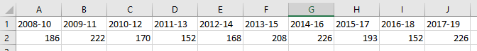
- If we import the data table from the above csv file worksheet using the ‘read.csv‘ function, set check.names to TRUE and set header to TRUE, the year-range column headings are imported but altered in the process: ‘2008-10’ becomes ‘X2008.10’ (see code and output below).
- Read more about check.names above.
- The data is imported as a dataframe by default. In R, a dataframe can take a mixture of data types (numeric, string, logical, factor), whereas a matrix can only take data of one type.
- stringsAsFactors=FALSE prevents R from converting continuous numeric values into categorical values.
library(tidyr)
library(dplyr)

myData <- read.csv("r_transformData.csv", check.names=TRUE, header=TRUE, stringsAsFactors=FALSE) 
If we set ‘header=FALSE‘ in the read.csv() function, and a new set of column headers is added by R, we need to find a workaround to get our original column headers back.
library(tidyr)
library(dplyr)

myData <- read.csv("r_transformData.csv", header=FALSE, stringsAsFactors = FALSE)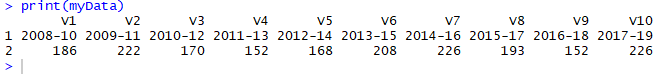
Replace the column headers in a dataframe in R
Now we’re going to replace the default column headers (V1, V2 etc.) with our original values (2008-10, 2009-11, etc.) from the imported table, using the steps below (included in the code below):
- Create a vector of values from the first row of the dataframe, using ‘unname()‘ to return a single row vector.
- Replace the dataframe column header values with the new vector using the colnames() function.
- The first row and column header row now contain duplicate values.
- We can either delete the first row which is now redundant, or filter it out when transforming our data from wide to long myData[-1,] using the ‘gather()‘ function from the tidyr package.
Transform the data from wide to long
Tidyr gather() example
myData_long <- gather(myData[-1,],Year,Value,’2008-10′:’2017-19′)
| myData_long | the name of our new dataframe |
| gather() | the function in tidyr to convert wide data into long |
| myData[,1] | our wide dataframe is named ‘myData‘ [-1,] represents [row selection, column selection] -1 selects all rows except the first a blank space after the comma denotes ‘all columns’ |
| Year , Value | denote the names (headers) of our new columns |
| ‘2008-10′:’2017-19’ | the range of columns in our wide dataframe to collapse into the two columns in the long df |
Plot the data using plotly
Plotly example code explained
a <- list(tickangle=-90,
title=””)
b <- list(rangemode = “tozero”)plot <- plot_ly(myData_long, x = ~Year, y = ~Value, type = ‘scatter’, mode = ‘lines’) %>%
layout(xaxis=a,yaxis=b)
| a and b | custom list variables with formatting for the x and y axes (referred to in the layout() function) |
| plot_ly() | the plot function |
| x=~variable | the variable to set as the x axis values |
| y=~variable | the variable to set as the y axis values |
| type=’scatter’ | the type of plot, other values e.g. bar or box; use ‘scatter for a line plot in combination with mode=’lines’ |
| mode = ‘lines’ | defines a line plot rather than e.g. a bar plot |
| layout() | assign the list variables a and b to the x and y axes |
Common cause of no line appearing on a plotly line plot
If you have a ‘flat’ table of data and have aggregated the data e.g. using dplyr’s gather() function, you may find when you try to plot the aggregated data that no line appears. Try ungrouping the data again before applying the plot_ly() function – the data will still be aggregated and the line should appear.
groupedData %>%
ungroup() %>%
plot_ly(x = ~Year, y = ~Count) %>% … other plotly functions …
Full code for above steps, with comments
library(tidyr)
library(dplyr)
library(plotly)

myData <- read.csv("r_transformData.csv",header=FALSE,stringsAsFactors = FALSE)

print(myData)

# create a vector of values from the first row of the dataframe
# using 'unname' results in a single row vector, otherwise a single row dataframe
# with column headers is created
# myData[1,] selects the first row and all columns from myData
  myHeaders <- unname(myData[1,])

# check the column header values
  print(myHeaders)

# replace the dataframe default column headers with our vector
  colnames(myData) <- myHeaders

# check the new values are in place
  print(myData)

# here we can either delete the first row which is now redundant
# or filter it out when transforming our data from wide to long myData[-1,]
# transform the data using 'gather' from the tidyr package
  myData_long <- gather(myData[-1,],Year,Value,'2008-10':'2017-19')

  myData_long$Value <- as.numeric(myData_long$Value)
  myData_long$Year <- as.factor(myData_long$Year)

# check the new structure
  print(myData_long)

# set parameters for the plotly function
  # values for the x-axis
  a <- list(tickangle=-90, title="")
  # values for the y-axis
  b <- list(rangemode = "tozero")

# create the plot using plot_ly()
  plot <- plot_ly(myData_long,
  	x = ~Year,
  	y = ~Value,
  	type = 'scatter',
  	mode = 'lines') %>%
     layout(xaxis=a,yaxis=b)

# output the plot
  plot