
Purpose
How to use Excel’s Sparklines — mini line, column, and win/loss charts
Excel’s Sparklines were introduced in Excel 2010, and are a neat way to add mini data visualisations, which sit within a cell or range of cells.
Links to topics on this page
- Reasons to use sparklines
- Method and video — how to create a line, win/loss or column sparkline
- Customize — size of sparkline chart
- Sparkline colors and line width
- Amend data range and values
- Sparkline axis options
- Video – sparkline groups
- Delete or clear a sparkline
- Limitations of sparklines
Reasons to use Sparklines
- Quick to set up;
- Easy to select line, win/loss or column sparkline;
- Aligned with other cell content;
- Several charts on one page with no-fuss alignment;
- Create a group of charts which can be quickly customized together;
- Small, clean design giving a quick overview;
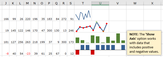
- Highlighting key elements, such as min and max values
- Viewing and comparing data trends;
- Sparkline graphs can fill a single cell, or be easily resized to fill multiple cells.
Method — create a sparkline (see video below)
- Enter the data for the line, win/loss or column sparkline into the worksheet (the sparkline can be created first, but it’s easier to start off with some data already entered).
- Select the cell to contain the sparkline.
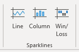
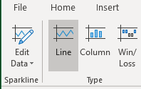
- From the ‘Insert’ tab on the ribbon, in the ‘Sparklines‘ section, select ‘Line‘, ‘Column‘ or ‘Win/Loss‘.
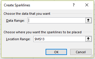
- In the ‘Create Sparklines‘ pop-up dialog box, select the cell range for the data, and click OK.
- The mini chart will appear in the cell.
- To change between chart types, simply select the sparkline, and choose another option from Line, Column or Win/Loss.

Add a column sparkline in Excel and increase the sparkline chart size by spreading across multiple cells, using ‘Merge & Center’
- Excel will only allow a sparkline to be first created in a single cell — if a range of cells is entered into the ‘Location Range‘ field in the ‘Create Sparklines‘ dialog, an error message will be triggered.
- So, as described in the method above, create a sparkline in a single cell.
- Select the sparkline cell and drag to cover additional cells to expand the sparkline into — across columns and also down rows if required. Don’t drag by the right-hand corner as this will copy the sparkline to another cell(s).
- Click on ‘Merge and center‘ (from the ‘Home‘ tab, or from the context menu when the selected range is right-clicked), and the chart will now span the new cell selection.
- To change the size again:
- select the sparkline
- click on ‘Merge and center‘ (which will unmerge the cells)
- make the new selection of cells for the chart to span
- click on ‘Merge and center‘.
- To keep a sparkline within one row and to increase its depth, simply increase the row height (as shown in the video above).
Customize sparklines — colors and line widths
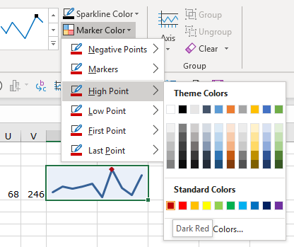
- The colors of sparkline columns, lines and markers are customizable.
- Select the sparkline and from the ‘Sparklines‘ section on the ribbon, choose color options from the ‘Sparkline Color‘ menu.
- Different colors can be chosen for high-low, first-last points for line markers, and bars.
- Line color and width are selected from the ‘Sparkline Color‘ dropdown menu.
Amend data values and data range
- To amend the cell range of the data loaded into the chart, select the sparkline and either:
- right-click and select ‘Sparklines | ‘Edit Single Sparkline’s data‘, or
- from the ribbon select ‘Edit Data‘.
- Adjust the cell range that contains the data for the sparkline.
- To amend values in the data range, simply amend the data and the sparkline will refresh with the new data, as for other chart types in Excel.
Sparkline axis options
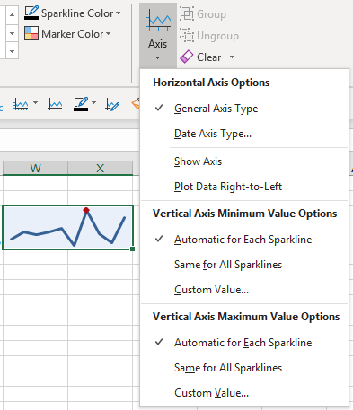
- Sparkline axis options include:
- setting a date type scale;
- show axis (will show if the minimum value of the axis is set to zero, or there are negative as well as positive values in the single or group of sparklines);
- plot data right-to-left
- set minimum and maximum values for the vertical (y) axis, and set for all sparklines in a group or for individual sparklines.
Sparkline groups (see video below)
- A group of sparklines can be created, as well as single sparklines. The main benefit is to customize all the charts together.
- The video above starts with a block of data, and with the first sparkline already created, spanning two columns (using the ‘Merge & Center’ command).
- To add additional sparklines, drag the right-hand corner of the sparkline down to fill the cells below.
- Each sparkline picks up the data in its row.
- When one of the sparkline charts is selected, a (vertical) boundary box highlights the grouped sparklines.
- Choose axis, marker and color options which will be applied to all the charts.
Delete sparklines — how to clear selected sparklines from a worksheet
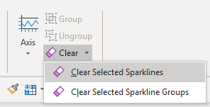
- There’s a specific command to delete a sparkline — you can’t just select the sparkline chart and press ‘Delete‘.
- Select the sparkline to delete.
- From the ‘Design‘ tab, select ‘Clear‘ and then either ‘Clear Selected sparkline‘, or ‘Clear Selected Sparkline Groups‘.
Limitations of Sparklines
- Sparklines can’t have annotations like data values or other labels;
- The size of markers on line sparklines is determined by the line width, so not customizable by size or shape;
- The axis color isn’t customizable and will only display if there are negative as well as positive values.